
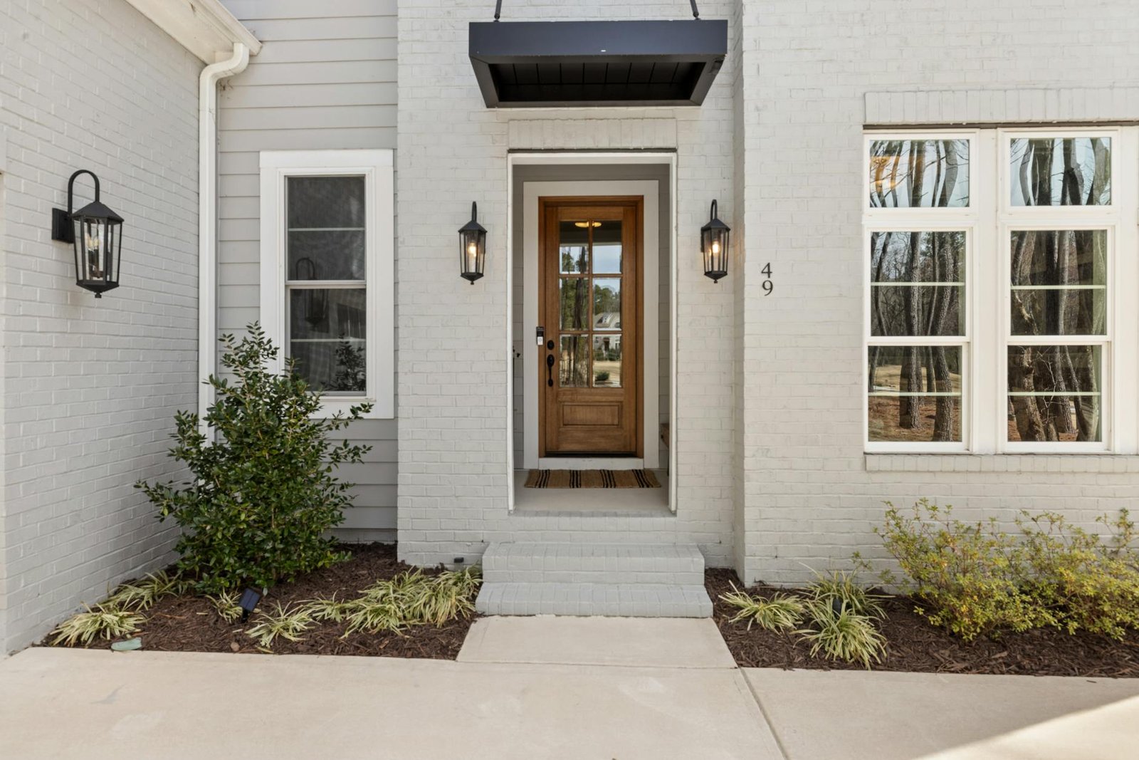
When it comes to selling a home, the fastest way to devalue the home is not just by using colors, but by using colors without a whole-house plan. For example, if a dining room is painted using one trend, a front door is painted using a different trend, and a hallway is painted using yet another trend, the owner may be disappointed by how the different colors make the entire house appear to be older rather than newer. This is called a patchwork palette, where there are colors that clash, accent walls appear to be isolated and buyers have to “walk through” three different decades before being able to enter the kitchen. Buyers typically do not describe this problem using design language, they describe it using dollars and cents, such as “We will have to repaint.” This is the real problem that you will face as a seller.
- TL;DR
- The real mistake: a patchwork palette, not a bold color
- Why this matters to your bottom line
- Use the Buyer-Neutral Continuity Score before you buy a single gallon
- A realistic example: how a seller spends $2,460 instead of over-renovating
- A practical reset plan if you do not want to repaint the whole house
- Common mistakes that waste money
- When paint alone will not solve the problem
- How to pressure-test your color plan before you commit
- Bottom line
- Frequently asked questions
- References
TL;DR
- The dated look usually comes from a disconnected palette, not from color itself.
- Buyers read clashing paint as future cost, hassle, and unfinished updating.
- Focus first on the entry sequence: exterior, front door, foyer, hallway, living area, and the first kitchen sightline.
- Use the Buyer-Neutral Continuity Score in this article to decide whether you need a touch-up, a partial reset, or a larger repaint.
- If money is tight, repaint connected main spaces before secondary bedrooms.
The real mistake: a patchwork palette, not a bold color
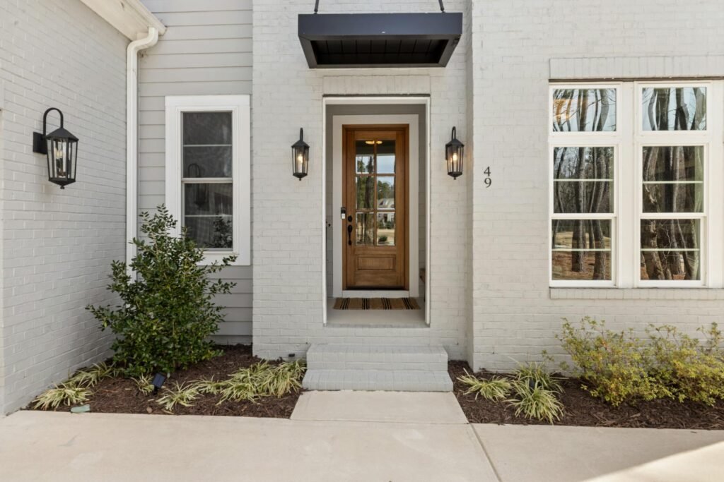
There are many reasons a house will feel like it is out of date. One of them is when the colors used in the improvements appear to have been improved independently; therefore, they do not create an overall plan for the home. For example, a home might be painted in warm beige and the flooring could be a cool grey, or the trim might be painted in cream and the walls painted blue-white. Or the dining room may be painted burgundy and the family room painted sage, the kitchen painted bright white, and the front door painted cobalt. Any of these colors could be right if used correctly, but when used together they all together create a home that appears to be different pieces that do not match and make the home appear outdated.
A “neutral” home can often appear outdated for many reasons, typically when the different undertones clash with each other causing an uncomfortable experience throughout the home. Buyers usually respond best when the exterior of the home and all interiors flow with the same colour scheme so that it feels like an intentional scheme. However, this doesn’t mean that every room must be painted in greige; what it does mean is that all rooms must coordinate through similar colours, especially in those areas that buyers will view within 30-45 seconds upon entering the property.
Why this matters to your bottom line
There is a money reason to care about this. The National Association of Realtors’ 2025 Remodeling Impact Report said the top projects agents recommend before listing are painting the entire home and painting a single interior room. In the group’s 2025 Profile of Home Staging, 83% of buyers’ agents said staging made it easier for buyers to picture the property as a future home, and 77% of sellers’ agents said improving curb appeal was one of the most common recommendations before listing. NAR’s consumer guide for sellers also specifically notes that paint jobs can improve curb appeal and shape a buyer’s first impression from the street.
Zillow’s 2025 paint-color research points in the same direction: buyers responded better to coherent, grounded colors than to loud, disconnected ones. In that research, a dark gray living room and an olive-toned kitchen were associated with higher buyer offer prices, while a daisy-yellow kitchen or living room was associated with offers nearly $4,000 lower. The lesson is not that every seller should paint dark green. The lesson is that color affects whether buyers see “move-in ready” or “work waiting after closing.”
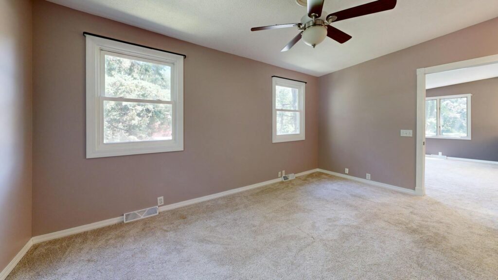
This is for general use only. The choice of paint colours can affect how buyers perceive the property, but resale prices will differ between areas, price ranges, styles of homes and general condition of all other aspects of the house. Discuss with a local listing agent to determine which paint colours will work best with your home and potential buyers in creating value as a resale.
Use the Buyer-Neutral Continuity Score before you buy a single gallon
Review the following categories, from the street to the entrance, from the foyer to the primary hallway through to the family room and on to the kitchen area of your home as we would as a potential buyer of your home. Assign each of the categories a rating of 0-2. “0” is an obvious issue, “1” is mixed opinion and “2” is a positive score. This is not a cost estimation or a design exercise; it is a tool for determining if your house is either ready for resale.
- Undertone match: Do the walls, floors, cabinets, counters, and brick or stone look like they belong to the same temperature family, or are warm and cool tones fighting each other?
- Entry calm: From the front door, do buyers see one clear field color, or do they immediately see multiple statement colors competing for attention?
- Trim consistency: Are trim, doors, and baseboards consistent in color and sheen across connected spaces, or does each area have its own treatment?
- Era check: Do you still have obvious trend markers such as a red dining room, Tuscan gold, muddy tan with gray flooring, or a random accent wall left over from a previous decade?
- Buyer repaint penalty: If you were moving in, would you feel pressure to repaint within the first 90 days? If the honest answer is yes, buyers will likely feel it too.
How to assess the score: 8-10 indicates the surface of the palette will work for most markets;5-7 indicates partial reset will occur within the main visible or exterior area of your home; 0-4 indicates that the home has multiple color combinations but will feel dated because of when the paint is still wet. If you are limited to doing one area, begin with the coloring of undertones, calming of entranceways and consistency for all trim areas first.
A realistic example: how a seller spends $2,460 instead of over-renovating
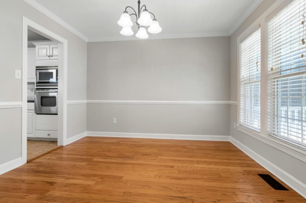
Here is a hypothetical but realistic case. Marissa and Andre are listing a 2,050-square-foot house and hoping to attract offers around $465,000. Their main floor has cream walls, a dark red dining room, a teal powder room off the hall, gray luxury vinyl plank installed two years ago, and a glossy cobalt front door. On paper, they have updated the home several times. Through a buyer’s eyes, the first impression feels inconsistent. Their Buyer-Neutral Continuity Score is 3 out of 10.
Instead of chasing a kitchen refresh they cannot finish properly before listing, they spend $2,460 on the color problem buyers will notice first. Their budget: $1,650 for a painter to handle the foyer, hallway, dining room, living room, and powder room; $420 for paint and primer; $130 for supplies; $220 for the front door and trim; and $40 for sample pots. They choose one soft, warm-leaning neutral for connected walls, a lower-contrast trim white, and a near-black satin front door that relates better to the roof and hardware. They leave the secondary bedrooms alone because they are not in the first sightline and photograph fewer of them. The house does not look dramatic afterward. It looks cohesive, which is exactly what they need.
| What you have now | What buyers tend to read | Best pre-listing move | Priority |
|---|---|---|---|
| Warm beige walls with cool gray floors | The house was updated in pieces | Repaint connected walls in a bridging neutral that works with the floor | High |
| A bright front door that does not relate to the roof, brick, or hardware | A trend choice, not a grounded first impression | Repaint the door in a deeper, more anchoring tone | Medium-High |
| One accent wall in the foyer, dining room, or living area | A leftover feature-wall era | Paint all connected main walls one field color | High |
| Pure white walls next to cream stone, beige tile, or warm cabinets | Cheap mismatch rather than fresh contrast | Shift to a softer white or light greige | High |
| Colorful secondary bedrooms behind closed doors | Personal taste but limited exposure | Leave them alone if clean, bright, and off the photo path | Low |
| A dark moody room with strong natural light and consistent finishes | Potentially intentional and current | Keep it if it feels deliberate, not random | Case by case |
A practical reset plan if you do not want to repaint the whole house
- Go outside and cross the street. Ask yourself if the siding, brick, shutters and trim all look like they belong to one house based on how they were built and used. If these signals are not consistent or if people are making their first impressions from seeing the outside only (before they ring the doorbell), then buyers may start subtracting from the property’s worth.
- Choose your anchor from fixed finishes, not from trends. Flooring, counters, brick, fireplace stone, cabinets, and tile are expensive to change. Your wall color should support those finishes, not fight them.
- Use the three-color rule for the main visible spaces: one wall color, one trim color, and one accent color. Most sellers get into trouble when they effectively have six accents instead of one.
- Repaint connected spaces before isolated rooms. Foyer, hall, living room, dining room, kitchen-adjacent areas, and the powder room near the entry matter more than a guest room at the back of the house.
- Remove the loudest date stamps first. Red dining rooms, heavy gold-beige, bright turquoise, purple-gray, and random charcoal accent walls often age a house faster than older furniture does.
- Test sample boards in daylight and in the evening. Paint color is inseparable from lighting. Use the same bulb temperature in connected spaces so the palette reads consistently in person and in photos.
- Style after you paint. The wrong drapes, art, throw pillows, and lampshades can reintroduce color chaos. Once the walls calm down, your accessories should support the reset, not undo it.
Common mistakes that waste money
- Choosing paint from a trend list before checking your floors and countertops. A popular color can still be wrong for your house.
- Repainting every room a different “safe neutral.” Buyers still experience that as fragmentation.
- Using stark white to freshen a home with warm finishes. In many houses, stark white makes beige tile, cream trim, or honey oak look more dated, not less.
- Ignoring sheen. Flat or matte often hides wall flaws better in lived-in homes, while too much gloss can make a fast repaint look cheap.
- Leaving the front door out of the plan. Zillow’s research has found that door color can influence buyer response, and the door is one of the fastest ways to send the wrong signal.
- Photographing colorful rooms you decided not to repaint. If a room is not helping the listing, do not feature it heavily.
- Confusing personality with visibility. You can keep some personality in a home, but not in the first sightline where buyers are making their first emotional and financial judgment.
When paint alone will not solve the problem
Sellers can often attribute the blame of paint to a bigger problem. If the cabinets are orange, the flooring is significantly worn, the lighting is harsh, or the house has an odor, then paint will help, but it isn’t going to replace the lack of modernness to the space. Similarly, not all houses need to be turned into neutral grays or beige. For instance, you cannot take a craftman home, midcentury, spanish-style, or historical, and force a generic flip palette onto it – you will only end up making that house look even worse. Our goal is not to erase the house; rather we want to make it appear cohesive and well maintained.
- If your fixed finishes are irreconcilable, repainting may not be enough. You may need to replace the smaller offender, such as a cheap gray floor in an otherwise warm house.
- If your budget is very limited, do a partial reset: front door, foyer, hall, main living room, one bathroom, trim touch-ups, and consistent light bulbs.
- If the home is architecturally distinctive, use muted, era-appropriate colors rather than defaulting to a generic builder white.
- If the walls have smoke stains, pet damage, or heavy patching, budget for proper prep and primer. Buyers notice poor surface condition before they notice subtle undertones.
- If you are unsure whether to keep one darker room, ask whether it looks intentional in photos. A moody room can work. A random moody room usually does not.
How to pressure-test your color plan before you commit
- Capture images of the outside of the home, the opening of the door, the foyer, the living room, and the first view into the kitchen at the same time of day and in a grid format. The same type of palette from each of the frames will give the buyer guests the same sense of feeling.
- Hold sample boards next to your floor, countertop, tile, and trim, not just on a blank wall. This is where undertone mistakes become obvious.
- Use the 90-day test: if you bought this house tomorrow, what would you repaint before you unpacked? Those are your real pre-listing priorities.
- Ask one local listing agent and one honest, non-family outsider the same question: “What color or room would you change first?” If both answer the same way, pay attention.
- Compare your first eight listing-photo candidates with recent sold homes in your price range. You are not copying them. You are checking whether your home looks more fragmented than the competition.
- Make sure all bulbs in connected spaces are in a similar warmth range before final color decisions. Paint that looks fine under mixed lighting often photographs badly.
Bottom line
Despite home color flaws, what ages a home most quickly is an unequally patterned colour palette throughout the exterior (entryway / main living area) of the home and/or having an uncoordinated decorative palette within the interior space of the house. This sends a signal to potential buyers that the home will require more expensive repairs than what is reflected in the original value of the home. An excellent way for sellers to create a more current feeling in their property is to allow for the initial sight line; match the undertones of the home’s permanently affixed materials with one another; and only make improvements that are perceived by a buyer on their initial price estimate of cost.
Frequently asked questions
Is all-white still the safest choice when selling?
Buyer reports showing buyers would prefer white in some areas of the home vs. other natural colors. Based upon the process of elimination through trial of various colors, those buyer reports can often reveal other tones based upon their perceived ambience versus actual usage by buyers. The more conservative way would be to say “use a majority of whites” vs. “various shades of white should be used throughout the world”.
Do I need to repaint every room before listing?
Usually no. Start with the entry sequence and the connected main rooms. Secondary bedrooms matter less if they are clean, minimally photographed, and not visually jarring from the hall.
What if my house has warm beige tile and cool gray floors?
It can be difficult to conceal certain combinations. To begin with, consider applying a bridging neutral on the wall, but be reasonable about your choice. You may want to consider replacing either the smaller or less expensive item if it is still dominating the appearance after applying a bridging neutral. This will probably be more of an effective long-term solution.
Can I keep one bold room?
For example, if a study or dining room is an area that’s well lit, then it can have more color than a foyer, hallway, or an open living space, but that’s only true if the color fits the style of the home and does not interrupt first impressions.
Does the front door color really matter that much?
The way a door looks can actually have a larger impact on buyers than retail sellers realise. Research from Zillow illustrates that in their experience, solid black front doors elicited greater buyer response than numerous brighter options. Additionally, by repainting a small area of the door, you enhance the visual effect of the front entrance and create a more substantial appearance to the exterior of the home.
How much should I spend before listing?
There isn’t one any number that works for anyone. A better approach is to spend just enough money creating an overall feeling of harmony before you do anything to the house. Most sales will involve primarily paint jobs, floor preparations, proper lighting, and/or staging compared to larger renovations that won’t provide immediate visual benefit.
References
- National Association of Realtors: NAR Report Reveals Home Staging Boosts Sale Prices and Reduces Time on Market – https://www.nar.realtor/newsroom/nar-report-reveals-home-staging-boosts-sale-prices-and-reduces-time-on-market
- National Association of Realtors: Top Remodeling Projects for Homeowner Satisfaction and Cost Recovery Revealed in NAR – https://www.nar.realtor/newsroom/top-remodeling-projects-for-homeowner-satisfaction-and-cost-recovery-revealed-in-nar-report
- National Association of Realtors: Consumer Guide – Marketing Your Home – https://www.nar.realtor/sites/default/files/2025-03/consumer-guide-marketing-your-home-2025-03-12.pdf
- National Association of Realtors: Remodeling Impact Report – Outdoor Features – https://www.nar.realtor/research-and-statistics/research-reports/remodeling-impact-report-outdoor-features
- Zillow: Best Paint Colors to Sell a House for More Money in 2025 – https://www.zillow.com/learn/best-paint-colors-sell-house/
- Zillow: Colors to Avoid and Embrace for Your Front Door – https://www.zillow.com/learn/what-color-paint-front-door/